Pages

Showing posts with label Vintage. Show all posts

Friday, May 31, 2013

Collage Money Holder

Well, once again it has been a while since I posted.  It's frustrating when the daily grind gets in the way of my creative time.  I have several projects lying around my studio just waiting for the finishing touches, but I just can't seem to get them done.  While I am grateful that I have a paying job, said job has been literally sucking the life out of me lately and in turn my creative spirit.

As my daughter so eloquently puts it, "Life rips the creativity right out of you and repeatedly stabs it to death".  Yes, a little dramatic, but she is a teenager after all.  :)

I did manage to complete a swap for a demo meeting and am extremely happy with the results.  I didn't feel like making a standard card this time so I created a money holder.


I adapted the size of this money holder from previous ones I have made.  We can only use current product for these swaps and since the slit punch has been retired for awhile now, I needed to find another way to keep the money in place.

This holder measures 3 1/4" x 7", and the inside slider measures 3 1/8" x 6 3/4".  I used the 1 3/4" circle punch to make the "holders" for the money on each end.


I used an Aqua pen filled with re-inker and water to make the splotches on the front of the holder.  Lay your project flat.  Make sure that your work area is protected and items that you don't want colored are not close at hand; I use an old lidded box when I do this so that I don't get ink where I don't want it.  I then took the pen in my right hand and knocked it against my left hand, moving it around the project.  For the larger dots, I let the pen drip onto the project. I also used the Spritzer tool to get a fine mist in some areas.


The flowers were colored by rubbing them over the ink pad and then misting them with water for a softer tone; I used Pool Party, Island Indigo and Midnight Muse.  The doily was folded and torn into fourths, then lightly sponged with Island Indigo.


Stamps: That's The Ticket
Paper: Island Indigo, Pool Party, Naturals White, Fan Fair DSP
Ink: Island Indigo, Midnight Muse, Pool Party
Misc.: Fabric Flower Trim, Pool Party Bakers Twine, Victoria Crochet Trim, Paper Doillies, Ticket Builder, Itty Bitty Butterfly, Scallop Edge, and 1 3/4" Circle punches, Basic Pearls, Vintage Wallpaper embossing folder, Crop-a-dile, Aqua Pen, Color Spritzer tool, Sponges, Mini Glue Dots


ETA:  I started this post a while back, many of these items are retiring.  Today (5/31) is the last day to get items from the Spring Mini and Monday (6/3) is the last day to order retiring items from the 2012-2013 Annual Catalog.  If you are interested in purchasing any of the retiring products, click here.

Wednesday, January 30, 2013

Triple the Celebration

Even though I used the same stamp for the focal point, I created three different card types/styles.  The SAB set Feeling Sentimental is a fun and actually very versatile set.

Here is a group photo.


The feminine version was done in a vintage/shabby style.

I'm not a huge pink fan, but I do like it with a dark brown.  Here I used Early Espresso and Pink Pirouette.  The DSP is from the Fan Fair pack. It has the most wonderful patterns and color combos.  I simply distressed the edges and then sponged them with both colors.  I also sponged over the paper with some of the pink.

For the embellishment I took a strip of Pink Pirouette and created a banner using the technique found in THIS post.  The sentiment is from Something to Celebrate(retired).  I tied a piece of linen thread around the Victoria crochet trim and then inked it up to age it a bit.  I placed a small Antique brad inside the largest of the Vintage Faceted Designer buttons.  The brad "legs" will just barely fit inside the button holes, but it was enough to bend them and secure it to the button.  I secured the lace and the button to the card with mini glue dots.

Stamps: Feeling Sentimental, Something to Celebrate
Paper: Early Espresso, Pink Pirouette, Fan Fair DSP
Ink: Early Espresso, Pink Pirouette
Misc.: Victoria Crochet Trim. Linen Thread, Vintage Faceted designer buttons, Antique brads, Basic Pearls, Square Punch, Sponges, Glue Dots, Distressing Tool


The middle card is clean and simple.


The black and white color scheme is elegant, yet still fun.  This could be given to either a female or male and could be used for a birthday, wedding or anniversary; or, simply just because you want to celebrate a child's accomplishment, a friend's promotion or any other life event.

Stamps: Feeling Sentimental
Paper: Basic Black, Whisper White
Ink: Pitch Black (Adirondack/Ranger)


The final card is geared with a masculine slant and is kind of a combination of the two other styles.  Clean and shabby? :)


It is also a CASE of the card posted HERE.  I LOVE Sandi's addition of the French Foliage stamp images, but for mine I wanted to keep it a little "cleaner".  Instead of linen thread I used Basic Black Taffeta ribbon to help highlight the sentiment and I used a black and tan (Crumb Cake) color scheme.  To ink the edges I used the ink pad directly on the paper to give it a little crisper edge than sponging would have.

Stamps: Feeling Sentimental
Paper: Crumb Cake, First Edition Specialty paper
Ink: Pitch Black (Adirondack/Ranger)
Misc.:Basic Black Taffeta ribbon


In all, I think it took me roughly half an hour to make all three cards, so time well spent in my opinion.  Even though the feminine card is really more my usual style, that is actually my least favorite of the three.  Go figure... 

Which do you like the best?

Tuesday, January 15, 2013

Vintage Type

Look what I scored the other day...


There is a wonderful little upscale re-sale shop in town called The Green Goat that deals mostly in re-purposed furniture and cool vintage items.  While the quality of the items she sells is upscale, her prices are more than reasonable. This little beauty cost me under $50.  I have seen similar ones priced on line anywhere from $75 to $700. Yikes!


I am so excited as I have been wanting a vintage typewriter for ages.  It will go great with the antique printer's trays I purchased a few months ago.  It weighs about 20 pounds and needs a little cleaning, but all the pieces are there and it appears to work just fine. I have a wonderful little vignette pictured in my mind with the typewriter and printer's trays...we'll see how long it takes me to get it completed.

In the meantime, take a look at this...


I have a stamp that matches. Imagine that! :)

I made a slit just above the paper bail (feeder) and slipped my "typed" piece of paper through it.  I thought the colorful paper was a nice contrast to the black and white image.

The patterned paper is a sneak peak from the upcoming Sale-a-bration catalog called Sycamore Street.  It will be available January 22nd! 


Supplies 
Stamps: You're My Type (retired)
Paper: Island Indigo, Rich Razzleberry, Whisper White, Sycamore Street DSP (SAB sneak peak)
Ink:Island Indigo, Rich Razzleberry, Basic Black
Misc.: Exacto knife, Sponge


Sunday, February 5, 2012

Excessive product use & an Anniversary Gift

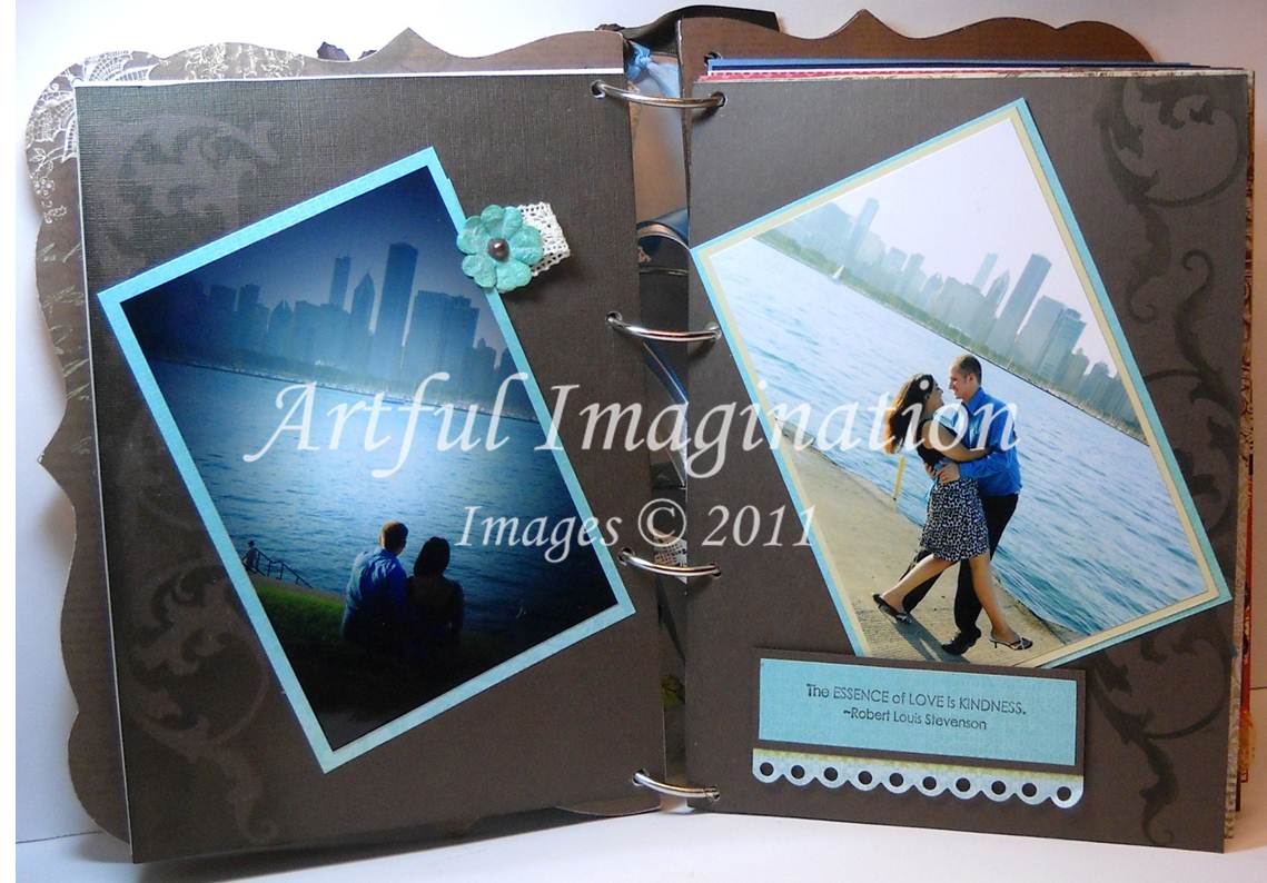
I haven't had much time or been in a creating mood lately (just a bit of creator's block), so I thought I would show you a project I made a few months ago for a classmate of mine. He wanted a special gift for his wife for their first anniversary. After seeing some of my work during a class presentation, he asked if I could make an album for her.

Traditionally, the first anniversary gift is paper, so I thought it was pretty appropriate. He gave me pictures and memorabilia from their engagement, wedding, and honeymoon, and told me cost didn't matter and I had free reign as far as design. Don't you wish all clients gave you that kind of freedom when creating? :) Although, depending on the project, it can be nice to be given some direction too.

Anyway, here is what I made:

Front Cover

I used several types of flowers to create this cover-Prima, Recollections, and Sizzix die cut. The center of the flowers are SU Basic Pearls and, Clear and Ice Rhinestone brads. The Chantilly Crochet Trim was woven in between the flowers for more depth. The word love in the book plate was printed in MS Word using a font called Angelic War.

Some of the Inside Pages
The album did not come with pre-cut inside pages, so I made my own. I wanted something heavier than just cardstock, but not as heavy as chipboard. I finally decided on heavyweight watercolor paper, which was then covered with either cardstock or DSP, as the design dictated. Before covering the watercolor paper, I placed reinforcement labels around each of the holes on both sides of the paper to help prevent ripping from wear and tear on the pages.

For the background I used a mask to add some detail to the textured cardstock. On the left hand side I sponged around the outside of the mask, and on the right I used the mask like a stencil.

To keep these gorgeous pictures as the focus, I added a hidden journaling tab behind one of them for the couple to add information later.

I used an old Coluzzle form I had to cut out the file folder. The metal photo turns keep extra pictures inside when the folder is closed. I also used a magnetic closure under the flower.


When you lift up the photo on this page, you will find a pocket for memorabilia and additional photos.

Inside Back Cover

Here is the final page and the inside back cover. The envelope was made using a Coluzzle form. Inside the envelope are once again additional pictures. I sponged the edges of the Celery satin ribbon with Marina Mist.

There are a total of 14 two page layouts in the album, plus the front and back inside pages and covers. The album was a lot of fun to make and gave me a chance to use some products and techniques that I hadn't used in a while.

Here is a list of items that I used to complete the album (aside from basic tools like scissors, paper cutters, bone folder, etc):

Stamps: Notes & Details, Essence of Love, Tiny Tags, Bliss, Enjoy Every Moment (SU) Pollen Dust (Fancy Pants)
Cardstock: Baja Breeze, Brushed Gold, Cameo Coral, Crumb Cake, Early Espresso, Marina Mist, Real Red, Basic Black, Whisper White, Very Vanilla, Vellum (SU)
DSP:
Love Letter, Patterns Series Paper Pack in Brights and Neutrals (SU) Chapter One (Kaiser Kraft) Gabrielle (BoBunny)
Ink:
Baja Breeze, Cameo Coral, Early Espresso, Marina Mist, Basic Black (SU)
Misc.: Glimmer, Metallic, Clear, Ice, and Fire Rhinestone Brads, Clip Assortment, Scallop Trim Border, Decorative Label, and Ticket Corner Punches, Crop-A-Dile, Top Note Die, Vintage Wallpaper Embossing Folder, Big Shot, Chantilly Crochet Trim, Certainly Celery and Marina Mist 5/8" Satin, Marina Mist and Early Espresso 1/8" Tafetta, Whisper White 5/8" Organza, Certainly Celery, Real Red and Marina Mist 3/8" Taffeta, and Early Espresso 1/4" Grosgrain Ribbons, Hemp Twine, Bitty Buttons, Mini Vintage Tags, Basic Pearls, Basic Rhinestones, Photo Turns (retired), Sticky Strip, Sanding Blocks, Sponges, (SU) Beyond the Page MDF Georgian Album, Chapter One Rub-Ons and Cardstock Stickers (Kaiser Kraft) Ornate Book Plate, Regal Mini Mask, (Ideology-Tim Holtz) Tattered Florals Die (Sizzix-Tim Holtz) Gabrielle brads (BoBunny) Magnetic Snaps, Precision File Set (BasicGrey) Labels #4 (Spellbinders) Essential Flowers in Moulin and Reflections, Vintage Trinkets-Flowers (Prima Flowers) Adhesive Rhinestones, Floral Embellishments, Boutique Fleur (Recollections) File Folder and Envelope Form (Coluzzle) 2" Binder Rings, Kodak Photo Paper, Reinforcement Labels (Staples) Scotch Quick Dry Adhesive (3M) Mono Adhesive (Tombow) Crystal Stickers (Mark Richards) 140Lb Watercolor Paper (Local Craft Store)

Now that is some serious product use! :) I don't think I have ever used that many products to complete a project in one shot.

How about you? What is the largest amount of products you have used to complete a project?

Have a great day!

Monday, January 16, 2012

Fresh Vintage

Here is a peak at another of the great FREE stamp sets you can earn during Sale-A-Bration (SAB). The Fresh Vintage set includes this beautiful floral stamp that can be used as a focal point or to create great backgrounds.

I used my In-Color markers to color the stamp. I took the color combo from the patterns in the DSP, Everyday Enchantment, which you can also earn for FREE during SAB. If you struggle with color combinations, then the SU Color Lab is a great place to find inspiration. You can even add your own favorite color combos!


This was a pretty easy card to put together. The item that took the longest was coloring the stamp and that only took a couple of minutes. Once stamped, I simply added the layers, placed the focal point, stamped the sentiment, and added the pearls. With this versatile layout you could create any kind of card, all you need to do is change the sentiment and the focal point.

SAB starts January 24th, so don't miss out on your chance to earn FREE products!!

Stamps: Fresh Vintage, Bring on the Cake
Paper: Baja Breeze, Calypso Coral, Lucky Limeade, Whisper White, Everyday Enchantment DSP
Ink: Baja Breeze, Calypso Coral, Lucky Limeade Stampin' Write Markers
Misc.: Basic Pearls

Enjoy the day!!

Thursday, December 29, 2011

Birthday Coral Sneak Peak

I hope that everyone had a wonderful Christmas! Although work was utter chaos this year, at home it was a very pleasant and relaxing Holiday for us.

Now it's time to start thinking about the new year. I've made several goals for myself for the coming year and I am determined to achieve them. One of them is to expand on a goal from 2011, and that is to continue to push myself to create things out of my comfort zone.

While the card I have to show you today is done in my favorite vintage/distressed style, the colors are definitely out of the box for me. As I have mentioned before, the orange color family is one that I typically avoid and lime green is not really at the top of my list either. However, in the upcoming Sale-A-Bration (SAB) catalog there is some very pretty vintage style DSP which features Calypso Coral and Lucky Limeade In-colors called Everyday Enchantment ~ I actually like it. :)

The paper is a wonderful mix of florals and patterns with a muted color scheme. In the close-up you can see several new items that will be available to earn FREE during SAB.


I used one of my favorite embellishments, the Mini Vintage Tag, to add some dimension and interest to the card. I stamped the tag with Lucky Limeade using one of the corners of the stamp used for the focal piece which is from the Elementary Elegance set. The birthday sentiment is also from the same set. The cute little brad and organdy ribbon are from the Everyday Enchantment Ribbon and Brad pack.

You can start earning Free SAB catalog items beginning January 24th. Come back and visit my blog for future sneak peaks and information.

Stamps: Elementary Elegance (SAB)
Ink: Calypso Coral, Crumb Cake, Lucky Limeade, Pool Party
Paper: Calypso Coral, Early Espresso, Lucky Limeade, Everyday Enchantment DSP (SAB)
Miscellaneous: Everyday Enchantment Ribbon and Brad Pack (SAB), Mini Vintage Tags, Chantilly Crochet Trim, Very Vanilla Taffeta Ribbon (retired), Curly Label, Scallop Trim Border and Scallop Edge Border Punches, Beautiful Wings Embosslit, Distress Tool (Cutter Kit), Dimensionals, Sponges


Happy New Year!!!

Sunday, September 11, 2011

A Warm Paisley Welcome

Here is a welcome card I did for my VC Rocks roommate a while back. At first glance, this may not seem like a Quick and Easy card, but it actually is...by my standards anyway. :) There is very little stamping on the card, and using the DSP as a design element, makes it go together pretty quickly.


I embossed a piece of Soft Suede card stock (to match the base of the card) with the Vintage Wallpaper embossing folder and then sponged the edges with Soft Suede. My lightening seems to have been a bit off for these pics, as that bottom mat is actually Night of Navy.


What I really like about the Paisley Petals DSP is that there are so many colors in the patterns that the color combos are almost limitless.

Stamps: Tiny Tags, Charming Ink: Always Artichoke, Baja Breeze, Night of Navy, Soft Suede Paper: Always Artichoke, Baja Breeze, Night of Navy, Soft Suede, Paisley Petals DSP Misc.: Mini Vintage Tags, Vintage Trinkets, Marina Mist Seam Binding (retired), Chantilly Crochet Trim, Vintage Wallpaper Embossing Folder, Big Shot, Sponges


Make it a great day!

Tuesday, August 2, 2011

Vintage Blue Butterfly

Wow, I didn't realize it had been so long since I posted. (Oops!) Well, I have been able to do some creating lately, so I will start sharing again. :)

This is a card I made for my VC Rocks roomie. I love the new BoBunny papers and had a great time creating this card.


The focal point of the card is cut from a collage sheet in the collection. The papers match wonderfully with many of the SU colors. I used Early Espresso for the card base and to ink up the edges of the papers and the chipboard sticker in the corner.

I also broke out my Twinkling H2Os that I haven't used in ages. I cut the butterfly out and highlighted the blue of its wings with Sky Blue to give it a little sparkle and then added some pearls for the body.

I also added some Sky Blue H2O highlights around the card as well to tie it all together.


Paper: Gabrielle Collection (BoBunny), Early Espresso Cardstock (SU)
Ink: Early Espresso
Misc.: Chantilly Crochet Trim, Vintage Trinkets, Linen Thread, Basic Pearls, Cutter Kit Distress Tool (SU), Chipboard Sticker (BoBunny)


Have a great day!

Sunday, May 15, 2011

Casing Myself

Since all the supplies were still laying out on my table, I decided to make a card based on the supplies I used to make the scrapbook page for the VC Rocks Blog Hop this past weekend. You can see the page in the post below.

I got a little sponge happy on this one, but I like how it turned out and will be using it for the demo swap at my upline's group meeting.

I used all the same colors as the scrap page, but switched out the DSP and the embellishments.


Everything except the card base was sponged-told you I got a little carried away. :) The pearl was again colored with a Sharpie maker and placed inside the jumbo eyelet. I ruffled the ribbon by placing a length of sticky strip down and then pressing the ribbon on to that, scrunching it as I went along. I used the Espresso marker to color the word "dream" from the sentiment stamp in the Razzle Dazzle set for the tag. Then pinned the tag to the ribbon using a safety pin from the Vintge Trinkets.


Stamps: Razzle Dazzle (the word dream from the sentiment)
Ink: Baja Breezer, Early Espresso, Certainly Celery
Paper: Greenhouse Gala DSP, Baja Breeze, Certainly Celery, Early Espresso
Misc:
Jumbo Eyelets, Jewels Basic Pearls, Certainly Celery Satin Ribbon, Sizzix Bigz Die Fun Flowers, Vintage Trinkets, Linen Thread, Jewelry Tag Punch, Sponges, Sticky Strip, Sharpie marker

Saturday, May 14, 2011

Color My World

Welcome to the first VC Rocks blog hop for the 2011 season! If you don't know what VC Rocks is, please check out the VC Rocks Blog for more info. If you come across a broken link or get lost along your hopping journey the VC Blog has a list of all the hop participants. Or, if you came directly to my site and would like to start the hop at the beginning, go to the VC blog to see who's first in line. :)

If you have been following the hop, you should have arrived here from Sharon's blog ~ Created By You What a great project.

The theme for our hop is Color My World. We were to design projects that used some kind of coloring technique. Not being a coloring type girl, very few of my sets are line art stamps or ones that lend themselves well to coloring; so, I was thankful we were able to use retired sets for this hop. I created three projects for the hop and the coloring techniques I used were with reinkers, markers and sponges.

This first card was SO quick and easy. I have always admired the CAS style of cards, but have difficulty making them myself as I prefer Vintage/Distressed. It has been sunny and really nice here the last couple of days, so I gave this card a "beachy" kind of feel in honor of the rain letting up.

Using a wet paint brush and reinkers in Baja Breeze, Pear Pizzazz and Crumb Cake, I color swiped a 3" x 3.5" piece of Naturals White cardstock. I then stamped the triple palm tree image from Balmy Breezes in Early Espresso. The word Dreams is from a sentiment in the Happy Harmony set. I used the Early Espresso marker to color just that word for stamping. The piece was then layered onto Baja Breeze with a Naturals White card base.

Stamps: Balmy Breezes, Happy Harmony (both retired)
Ink: Baja Breeze, Pear Pizzaz, Crumb Cake reinkers, and Early Espresso marker
Paper: Baja Breeze, Naturals White
Misc:
Paint Brush


This next card uses my all time favorite color combo-Brown and Teal. For this one I used Baja Breeze and Early Espresso. I first inked the flower image from Embrace Life with Versamark and then with Early Espresso before stamping and clear embossing. By inking with Versamark first, before your color, and embossing with clear powder, you then basically have any "color" embossing powder you want.

Using the Baja Breeze marker, I then colored in the flowers to give them more depth and make them stand out as a focal point.

I randomly stamped the branch/leaf stamp from the set on the Baja Breeze mat in Baja ink. I then used the Weathered background stamp, also with Baja ink, over that. I finished off the focal point with Early Espresso grosgrain ribbon and stamped the sentiment in Early Espresso.

Stamps: Embrace Life (retired)
Ink: Baja Breeze ink pad and marker, Early Espresso
Paper: Baja Breeze, Early Espresso
Misc:
Clear Detail Embossing Powder, Heat Gun, Early Espresso 1/4" Grosgrain Ribbon


My final project is a 6" x 6" layout that is definitely more my style and again uses the Espresso and Baja color combo.

I colored the Presto Patterns DSP with Baja Breeze and Crumb Cake using sponges. Next I spritzed it in a couple of places with Log Cabin Smooch Spritz, and then spritzed again with Frost White Shimmer Mist (made from Frost White Shimmer Paint). Finally, I sponged on some more Baja and also Pear Pizzazz. I colored the edges with Early Espresso and a sponge.

I stamped the butterfly from Clearly For You on Naturals White cardstock in Early Espresso. Then I colored it in with Baja Breeze and Certainly Celery markers and cut it out. I sponged the Vintage Tag with Pear Pizzazz and adhered the butterfly with a Pop Dot clipping it to the piece with a Mini Library clip. The pearls were colored with a green Sharpie marker.


For the flowers I used the Sizzix Bigz Die-Fun Flowers. I misted them with water and then crumpled them up. After carefully uncrumpling, I sponged the entire flower with Baja Breeze ink and then sponged the edges with Early Espresso.


I colored another pearl with the green Sharpie and placed it on top of an Antique brad for the center of the flower. I colored the edges of the Celery ribbon using a sponge and Early Espresso to give it a grungier look. To "ruffle" the ribbon I put down a length of Sticky Strip tape and then scrunched the ribbon together as I pressed it down on the tape.

Stamps: Clearly For You
Ink: Baja Breeze ink pad and marker, Early Espresso and Pear Pizzaz ink pad, Certainly Celery marker
Paper: Presto Patterns DSP, Baja Breeze, Early Espresso (textured)
Misc:
Antique Brads, Jewels Basic Pearls, Certainly Celery Satin Ribbon, Sizzix Bigz Die Fun Flowers, Vintage Tags, Mini Library Clips, Log Cabin Smooch Spritz, Frost White Shimmer paint (made into shimmer mist), Pop Dots, Sponges, Sticky Strip, Sharpie marker


I hope you enjoyed the projects, but it's time to move on. The next stop on the hop is Angela's blog ~ Life with a Wiener Dog. Frankfurter is very cute and Angela's projects are pretty cute too. :)


Have fun!

Saturday, March 12, 2011

Butterflies and Aged Metal

Finally, I'm posting again! Sorry to take such a long hiatus; hope you like my "come back" card. I did this for a recent demo swap with my upline's group.

I really like aged metal pieces and the whole distressed look, but sadly SU no longer offers the Hodgepodge Hardware in the aged selections. :( So what's a girl to do when she needs that aged metal look, but can only use SU products? Improvise! As the Styled Silver HH was too shiny and bright for the overall "feel" for this card, I decided to alter it.First, I used some medium grit sandpaper to sand the the Hodgepodge pieces-brads too. This was better, but it was still a bit too bright for me. So then I decided to age it further with alcohol ink. Again, since this was for a demo swap, I could only use SU products. I created my own alcohol ink using Soft Suede reinker and rubbing alcohol in a mister bottle. I sprayed the metal pieces with the ink and then heat set until almost dry. Finally, I took a paper towel, wiped off the excess ink and then buffed the pieces a bit. Here is the close up.

Stamps: Just Believe, You're a Gem
Paper: Baja Breeze, Chocolate Chip, Crumb Cake, Elegant Soiree DSP
Ink: Baja Breeze, Chocolate Chip, Crumb Cake, Soft Suede reinker
Misc: Beautiful Wings Embosslit, Styled Silver Hodgepodge Hardware, Distress Toll-Cutter Kit, Linen Thread, Sponges, Medium grit sandpaper, Rubbing Alcohol, Misting Bottle


Sorry the pictures are blurry. I retook them several times but with no better results. I think I may need to purchase a new camera.


Enjoy!

Wednesday, September 29, 2010

Quoth the raven, `Nevermore.'

Every time I see a raven I always think of Edgar Allen Poe's poem. It has been a favorite of mine since reading it many, many years ago as a teen. I much prefer the grungy, creepy, scary aspects of Halloween versus the cutesy, so when SU introduced their newest Halloween sets last year I was thrilled!! Then this year they added more, with ravens to boot. Needless to say I was ecstatic!

I can't tell you how much fun it was to create this card for a recent swap I participated in. The black lace trim, aptly named Raven, is wonderful to work with and I love the way the card turned out.


For the main image on the card I used the 1 3/4" circle punch on a post-it note, getting as much of the sticky portion as possible. I placed this on the Whisper White cardstock and then brayered Basic Black over the top half of the piece. I sponged More Mustard on the bottom half and then Rich Razzleberry over the bottom portion of Mustard and around the bottom edges.

With the post-it note circle still in place, I then sponged Basic Black around all the edges and brought it down a little over the Mustard to soften the brayer lines. I then stamped the Raven with Basic Black.

To give the moon a little more "umph", I sprayed a little bit of Vanilla Shimmer Smooch Spritz on my finger. Starting in the middle, I rubbed the spritz in a circular motion toward the edges of the circle, avoiding the raven. This made the spritz coverage a bit uneven, and though it's hard to tell in the picture, it made it look a lot more like the actual moon high in the night sky. I then took a very small paint brush and Basic Black reinker to make the "clouds" passing in front of the moon.

The raven's eye is one of the new Jewel Basics Pearls colored with a red sharpie (see this post for a little more info on coloring them). I distressed the edges of the image with the distress tool from the Cutter Kit and inked the edges of both the image and Pumpkin Pie mat with Basic Black.

The Rich Razzleberry piece is embossed with the Vintage Wallpaper embossing folder for the Big Shot. I placed a piece of double sided tape along the back edge and placed the Raven lace trim on it. I bunched it together in some places and left it flat in others.

The large mat is from the Neutrals Patterns DSP Stack. I stamped it with French Filigree and the "31" is from the new Dark & Dreary set in the Holiday mini. Both the Rich Razzleberry and DSP pieces were also sponged on the edges with Basic Black.


But the raven still beguiling all my sad soul into smiling...

Saturday, July 17, 2010

VC Rocks-Blog Hop

Welcome to the July Blog Hop for the VC Rocks yahoo group! This is the first blog hop I have ever been involved in, other than looking, so I hope you enjoy the projects I've made for today.

You should have arrived here from Carolyn's blog, Inking the Night Away.

As I mentioned in a previous post, when I first saw the new Level 1 Hostess set, Because I Care, it really didn't appeal to me and I figured I wouldn't use it very much. I am finding that I like this set a lot.

One of my new favorite color combos is Marina Mist and Early Espresso. It lends itself well to the vintage style, which I am so fond of, as well as bold contrast.

If you haven't tried using Smooch Spritz yet, what are you waiting for? That stuff is awesome. It gives quick color and shimmer for fast easy cards, or helps with a dramatic effect.

Here's how I made this card:
  • Base card is a standard size 4.25" x 5.5" in Early Espresso
  • Marina Mist mat is 4" x 5.25". I sponged the edges with Marina Mist ink.
  • Using Log Cabin Smooch Spritz, I covered a 4" square of the Presto Patterns DSP and then misted over that with Vanilla Shimmer. I then tore two of the edges and inked all four sides with Early Espresso ink.
  • The small Early Espresso mat is 2.5" x 3.75". I distressed and inked the edges.
  • The Naturals Ivory piece is 2.25" x 3.5". I distressed the edges and then sponged it with both Marina Mist and Early Espresso.
  • I inked up the Hydrangea with Marina Mist and Always Artichoke and stamped it on a scrap of Very Vanilla, cut it out, and then popped it up with dimensionals.
  • The sentiment is stamped in Early Espresso.
  • The Mini Library Clip and Linen Thread just give it that nice little extra touch.
Here is a list of supplies:
  • Stamps: Because I Care
  • Ink: Early Espresso, Marina Mist, Always Artichoke Marker
  • Paper: Early Espresso, Marina Mist, Naturals Ivory, Very Vanilla, Presto Patterns DSP
  • Accessories: Log Cabin and Vanilla Smooch Spritz, Mini Library Clips, Linen Thread, Distressing Tool, Sponges, Dimensionals

My second project features several items from the Summer Mini Catalog. You can keep this little Notepad Tin in your car or purse and always have paper handy for those things you want to remember.


Here is a list of supplies:
  • Stamps: Tropical Party, Favorite Thoughts, Dreams Du Jour
  • Ink: Old Olive, Pumpkin Pie, Rose Red, So Saffron, Tempting Turquoise
  • Paper: Old Olive, Cherry Cobbler, Pumpkin Pie, So Saffron, Tempting Turquoise, Whisper White, Island Oasis DSP
  • Accessories: Old Olive 5/8" Grosgrain Ribbon, Vanilla Shimmer Smooch Spritz, Rhinestone Brads, Corner Rounder, Dimensionals, Mini Glue Dots, Stamp-a-ma-jig, Ruler, Exacto Knife, Metal Tin (This is one that SU used to sell, but any will work.)

Here is the inside of the tin.

How I made it:

Outside
  • The Old Olive mat on the front of the tin measures 4 1/4" x 4 7/8". I cut the DSP to 2" x 4 1/4", rounded the corners on both pieces and then adhered the DSP to the cardstock.
  • I then covered the seam with the Old Olive grosgrain.
  • I used the sentiment stamp from Dreams Du Jour to stamp the word Life. I colored just that word with an Old Olive marker and then used my Stamp-a-ma-jig to place it.
  • I cut out the large Pumpkin Pie flower from a piece of the DSP and popped it up with dimensionals, then stamped the other flowers from the set and cut them out. I misted a couple of them with Vanilla Shimmer Smooch Spritz.
  • I stamped the frond in Old Olive and cut around it. Using a tip from Jackie Topa, I then sponged the edges of the frond with ink to help cover up any white areas I didn't want seen.
Inside
  • The DSP for the bottom of the tin (under the notepad) measures 4 3/4" x 5 3/8", the lid measures 4 7/8" x 5 1/2". Use plain copy paper to make yourself a template as you will need to play around with rounding the corners and measurements will vary depending on the type of tin you use. I rounded the corners on this project with my paper snips, usine a template I made.
  • The bottom DSP is adhered with glue dots, and then the notepad adhered on top of that.
  • For the lid, lay your pen on the DSP where you would like to place it, using a pencil draw a line on either side of the pen. Using a ruler and exacto knife, cut two slits in the paper along your pencil lines, just long enough to pull the ribbon through to make a loop. Place your pen in the loop, pull the ribbon tight enough to hold the pen. Flip the paper over and tape down the ends of the ribbon
  • Next I stamped the sentiment from Favorite Thoughts in Cherry Cobbler on Whisper White cardstock and matted that with Cherry Cobbler and Old Olive
  • The flower was cut from the Island Oasis DSP and spritzed with Vanilla Shimmer.

I hope you have enjoyed the blog tour so far. There are some very talented ladies on this hop and the next one is Nancy's blog at Fancy Nancy Kay If you should happen to get lost along the way, or there is a broken link, you can find all the blogs on the tour at the VC Rocks Blog.


Have a great day!

Monday, May 17, 2010

Baja Time


I'm glad that Baja Breeze is one of the returning In-Colors with the Color Renovation; it goes great with so many different colors. I know that this particular ribbon probably won't be coming back,(even though I really want it to) but I'm sure SU will have something just as wonderful. Trying to use up some retired items to make room for all the new ones coming in. Yeah!!

The card design is actually a Mojo Monday sketch found here. There are some really awesome sketches on the site for when you're in a rut, or need to put together something spectacular, but don't have the time to design it yourself.

I ran the textured Baja Breeze through the Big Shot with the Distressed Texturz plate, then used the distressing tool on the edges. The Sahara Sand piece is stamped with the clock face and cog stamps in Sahara Sand. I then stamped the cogs again, in chocolate chip, and secured the Artichoke 1/2" circle with a vintage brad. I distressed the Sahara Sand piece and it's Chocolate Chip mat with the distressing tool. All the edges, except for the card base, are sponged with coordinating ink. I then simply stapled the ribbon on and frayed the edges, so that it was "distressed" too. :)

To match up the torn edges of your DSP and mat layer, simply cut your pieces to the appropriate size, then line up the bottom of your DSP with the bottom of your mat and tear both pieces at the same time. Center your DSP on your mat and voila-matching edges!


Stamp: Sense of Time
Paper: Always Artichoke, Baja Breeze-textured, Chocolate Chip, Sahara Sand, DSP (retired)
Ink: Baja Breeze, Chocolate Chip, Sahara Sand
Accessories: Cutter Kit Distressing Tool, Vintage Brads, Big Shot, Sizzix Distressed Texturz Plate, 1/2" Circle Punch, Baja Striped Ribbon (retired), Sponges, Stapler

Thursday, April 29, 2010

Distressed Razzleberry Birdie

I made this for one of my upline's demo meeting swaps. I definitely would not do this for a LARGE swap; it's a bit time consuming, but so much fun to make and I really like how they turned out.

Rich Razzleberry is the base of this card. The larger mat is Soft Suede and the DSP is from the Cottage Wall collection. For the main image, I colored the Wings of Friendship stamp with Razzleberry and Old Olive markers and then misted the stamp with water before stamping on Naturals White cardstock.

After stamping and cutting out several of the open flowers, I sponged the edges, placed a rhinestone brad in the center and popped them up with dimensionals. I wasn't happy with the size or look of the olive ribbon on it's own, and didn't want the polka dots showing on the soft suede ribbon, so I flipped it over and layered the olive grosgrain on top.

Editing to Add: I used the distressing tool from the Cutter Kit on all the layers. On the focal layer with the bird, I also used my scissors. I opened them up, like if I was going to curl ribbon, placed the edge of the paper in the "v" of the scissors and ran them down the edge of the paper. I then added a few small slices along the edges. Be careful though, you need a light touch when doing this, otherwise you could slice your image in half. Ask me how I know... :)

Enjoy!

Monday, March 1, 2010

Tiny Vintage Tags


I really like the new punches that SU has come out with! The little tag punch and Tiny Tags stamp set are so fun to use. I think the tags add that perfect little touch to your cards. And while I am generally not a fan of a scalloped edge, I do like the new Scallop Trim Border punch. What's really great is that right now, you can get this punch Free during Sale-A-Bration. It has a matching corner punch in the Occasions Mini.

For these I used a card base of Kraft cardstock. The Bella Bleu dsp lent itself nicely to the color scheme of yellow and blue. I was pleasantly surprised at how much I really like this DSP. I have had it for quite a while and this is the first I have used it. It has some gorgeous patterns and a great muted/natural color scheme.

The flowers are from the Vintage Vogue stamp set. Would it surprise you that I absolutely adore this set???? For those that know me probably not. :) I stamped the large flowers in So Saffron on Barely Banana cs, the smaller flowers are stamped in Barely Banana on banana cs and Brocade Blue on Kraft cs, the leaves are also stamped on Kraft cs in Always Artichoke. I distressed the mat pieces and inked the edges of all the pieces in coordinating colors.

I couldn't find my Natural Linen thread (need to do some organizing!) and I thought the Hemp Twine was too thick for the look I was going for, so I "split" the Hemp Twine into two strands to attache the tag. It worked great, plus it stretches the amount of twine I have!!

For this one I used the masking technique. I stamped the large flower from Vintage Vogue in Rich Razzleberry and the leaves in Old Olive on Naturals White cs. I then masked them with a post-it cut into each shape and stamped over that with the French Filligree background stamp in Soft Suede. The small flower and scalloped edge are Crushed Curry, the mat is Rich Razzleberry and the base is Soft Suede.